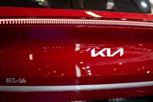
Kia’s New Logo and the Search for “KN Car”
 At the beginning of 2021 Kia launched a new logo as part of a brand refresh. Kia chose for symmetry and rhythm. This logo was meant to show a commitment to transformation underlining the new tagline, “movement that inspires.” Yet, while many people can recognize the “KIA” letters within its new look, there are still tens of thousands of searches for “KN Car” each month.
At the moment if you search for “What is KN Car,” you’re going to get a full page of non-Kia websites writing about the confusion regarding the logo. You’ll only find two Kia stories on page one of your search, both from savvy dealers who took the time to write SEO-winning content. These search results, more than two years after the logo change, represent a wasted opportunity for Kia, but some great lessons for business owners.
Know What Others Are Saying About You
Most businesses these days have to have a digital strategy, which includes monitoring what is being said about your business, either by reviews, inbound links, or general chatter (think of Google Alerts for various keywords).
It seems that early on that Kia knew people were confused about the rebrand, but didn’t really help those who were. Even now, as noted above, you only find a couple dealerships that have addressed the issue.
With a fraction of the budget that it spent on the brand refresh, Kia could have built some marketing campaigns to win the search results through paid and organic results.
Paid Strategy
Kia could have launched a keyword campaign to advertise for those searching for “KN Car.” These people were curious enough to ask the Internet after seeing the logo in real life and might even have been potential customers.
The advertising links could have clicked through to explainer pages similar to the ones done by the dealers we mentioned or to something more fun and self-deprecating (though the latter would have assumed some kind of humility regarding the logo failure).
Semi-Paid Strategy
Kia could also have written some of its own content, some of it serious and some of it fun, while encouraging it to be picked up by media outlets always looking for news. They may have tasked some internal assets with creating the content, while the organic reach that the content would garner would be free.
Don’t Abandon Your Branding
Perhaps the biggest mistake Kia made in this brand refresh was going from a globally recognizable logo to something abstract and asymmetrical. Worse, it was so strong a departure from the previous logo as to be unrecognizable for many.
If we’ve learned anything in the era of Nike, Apple, and Chipotle, it is that consumers gravitate (understandably) towards simple logos. This also makes marketing easier, since complicated logos can be harder to reproduce in various sizes and formats.
If you’ve got something that works and your customers know, go for smaller changes rather than radical ones.
Don’t Be Afraid to Say You Were Wrong
Kia could have done what Gap did exactly six days after releasing their new logo in 2010: go back to the previous one. The backlash against the logo from allies of the brand and even neutral consumers was enough to realize they messed up.
While it didn’t mean Gap didn’t have egg on its face from the attempt at a new logo, it did mean that they at least began to wipe most of that egg away.
Are you thinking about a new logo or a brand refresh in general? We know some experts who can help you with that. Give us a call.


